Help
Find help and learn about the HUG Manager app Version 1.4.6.
About
HUG Manager is a native application used for content creation and publishing of home user guides.
Upload to any web hosting server, a unique home user guide webapp, for every plot. Access from any modern web browser on any device; be it a phone, tablet, or desktop computer.
Installation
Insert the USB flash drive into your computer. 
Each operating system has a folder containing the respective installation files. Open the folder for your computers operating system.
If you or your company IT department require different installers or software packages, contact us and we will make efforts to accommodate you.
Windows
Use an x86 based architecture computer, running Windows 10 or later.
Double click the file ending in .exe. This will start an automatic installer. After a few moments a window will popup showing a spinning progress indicator.

The Windows taskbar button will display a progress bar for the installation. Once complete, the app will automatically open.
The app can also be opened from the Start Menu or find the HUG Manger app using Windows Search.
macOS
Use a Mac with an M1 or later.
Double click the file ending in .dmg. This will mount the disk image and open a Finder window. Drag the app icon onto the Applications folder to install. The installation should take a few seconds.
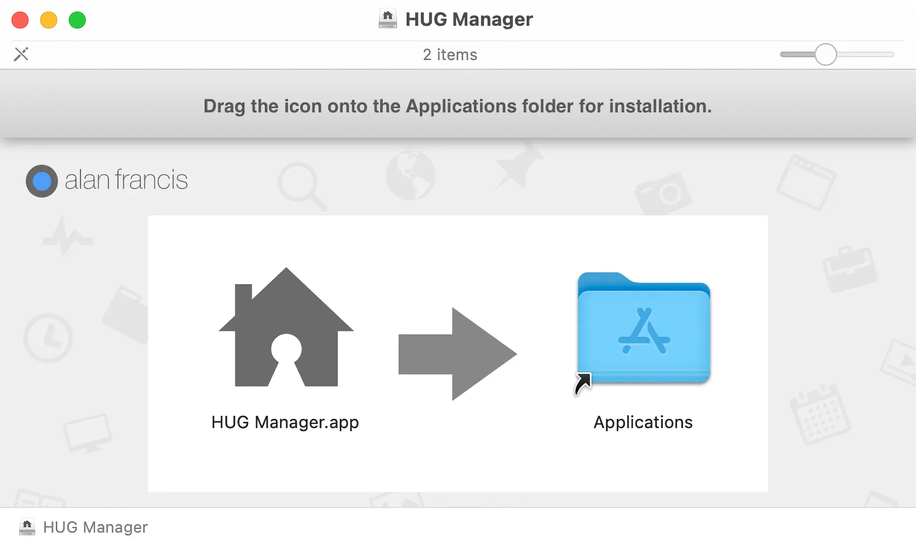
Open the HUG Manager app from the Finder or using Launchpad.
Linux
Use a computer with an x86 based architecture.
Contact us if you requirer a specific installation file format for your Linux distribution.
Gnome
The popular Linux distribution Fedora was used as our target Linux operating system. To install the supplied .rpm on Fedora, you can right click on the RPM file in the Files app and click Open With Software Install.
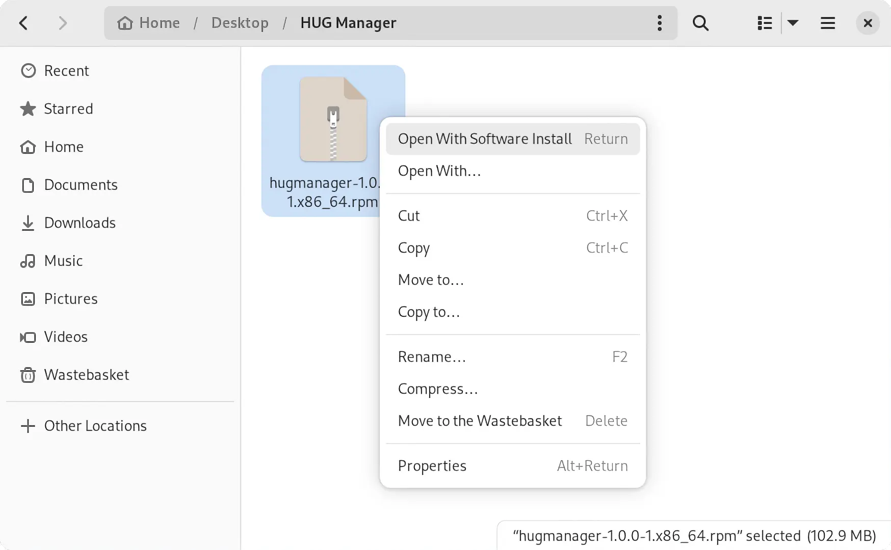
This will open the Software Center app. Once loaded, click the Install button.
Command Line
Alternatively from the command line use the following:
sudo dnf install hugmanager-1.4.6-1.x86_64.rpm
First Run
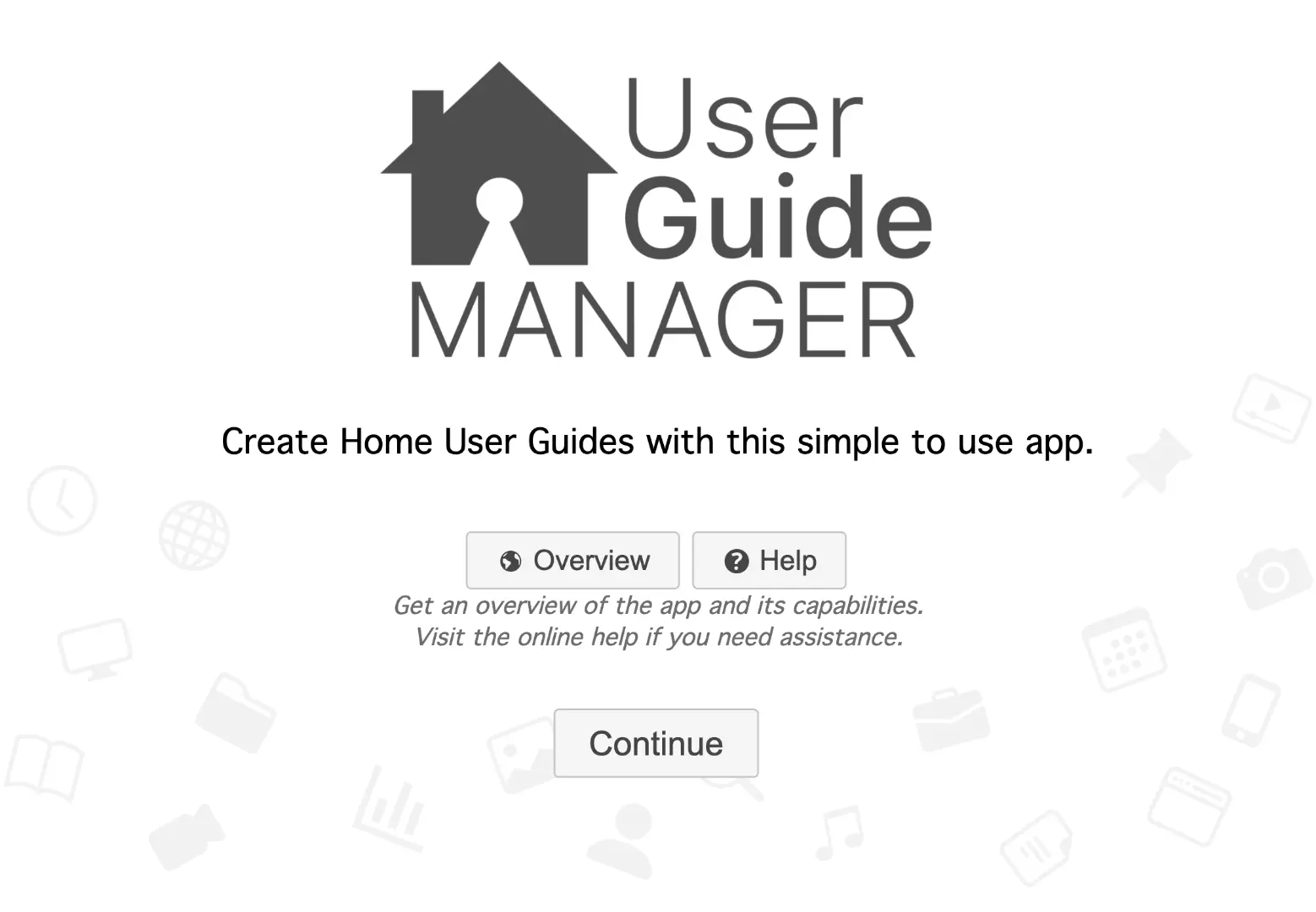
When you first run the app, you'll be presented with the Welcome window. Giving you the option to visit a website for an app overview or find help via your default web browser.
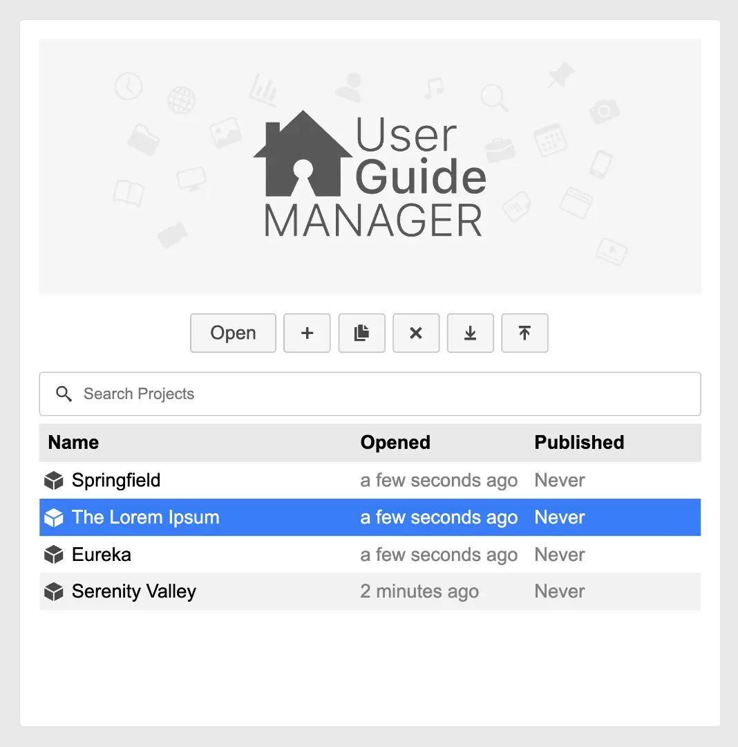
Projects
The home user guides you create for each development will be stored in a Project.  For each new development, you should create a new project.
For your first run of the app, you will have a default project called The Lorem Ipsum.
Search
Filter the list of projects by entering text into the search field.  Remember to remove the text from the field to see all of the projects.
Open
Select the project you want to open, then click the Open button. Alternatively you can double click the project to open.
Add
Click the Add button  and a new project will be created called The Lorem Ipsum. The new project will be selected for you.
Duplicate
Select the project you want to duplicate, then click the Duplicate button.  The new duplicate project will be selected for you.
A time saving tip is to duplicate a previous project that is similar to your new project.
Delete
Select the project you want to delete, then click the Delete button.  You will be asked to confirm that you want to delete. This can not be undone.
Import
You can import previously exported projects that you, or others have created. Click the Import button  and your operating systems file picker will be displayed. Find and select a project file with the extension of
 .hugproject and click Import.
Export
You can export projects that you have created. Click the Export button  and your operating systems folder picker will be displayed. Find and select the folder you would like to export the project to and then click Export. A file with the extension of
 .hugproject will be created.
Settings
Configure settings related to the overall project. These pieces of information have multiple uses when creating the webapp, eBook and PDF.
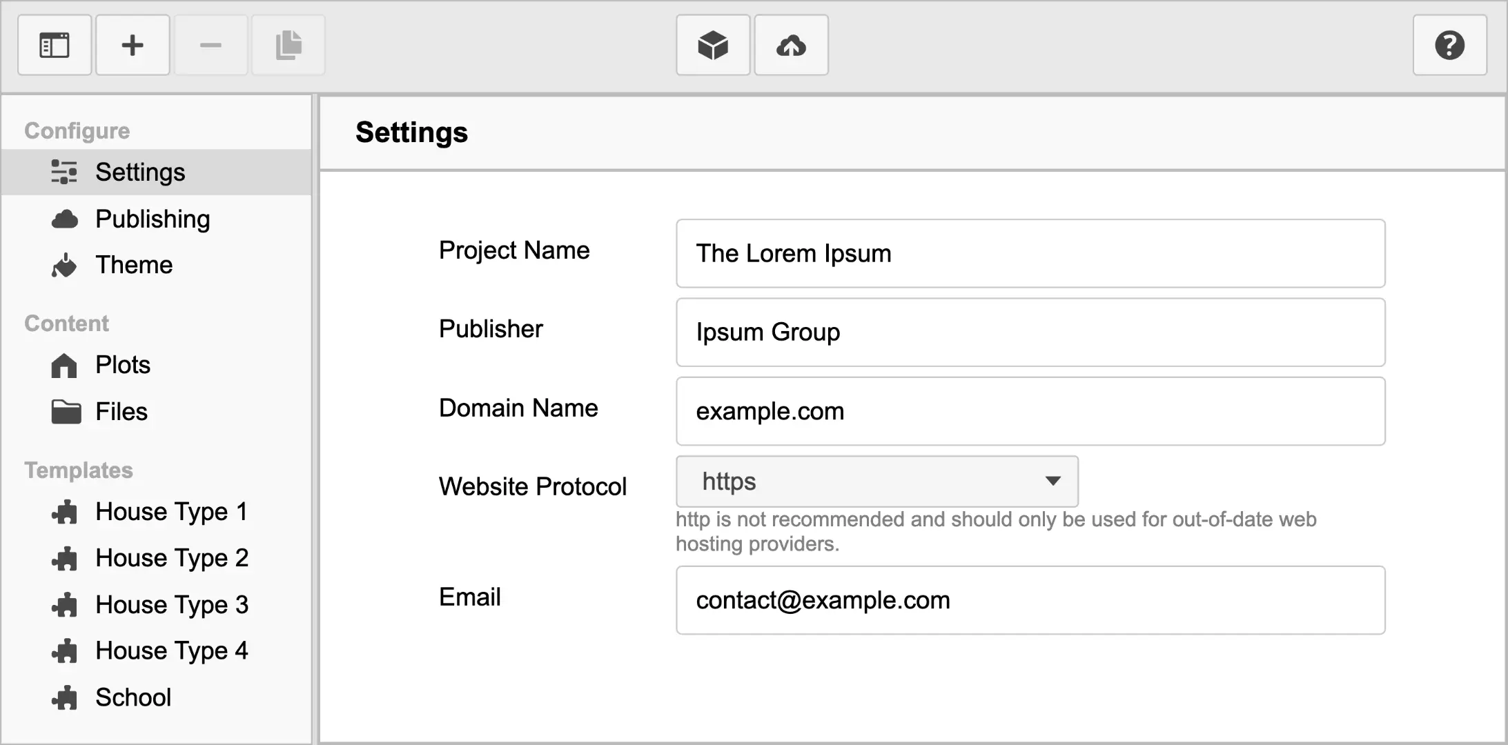
Project Name
Enter the name of the development.
Publisher
Enter the name of company of the home user guides will be published by. This would usually be your company name.
Domain Name
Provide the domain name that will be used to access the webapp. Do not include the protocol.
Website Protocol
https is the recommended and most common protocol. http is not recommended and should only be used for out-of-date web hosting providers.
The email address used for contact via the HUG Webapp.
Publishing
These are settings related to uploading to web hosting. The hosting company or your company IT department will provide these configuration settings.
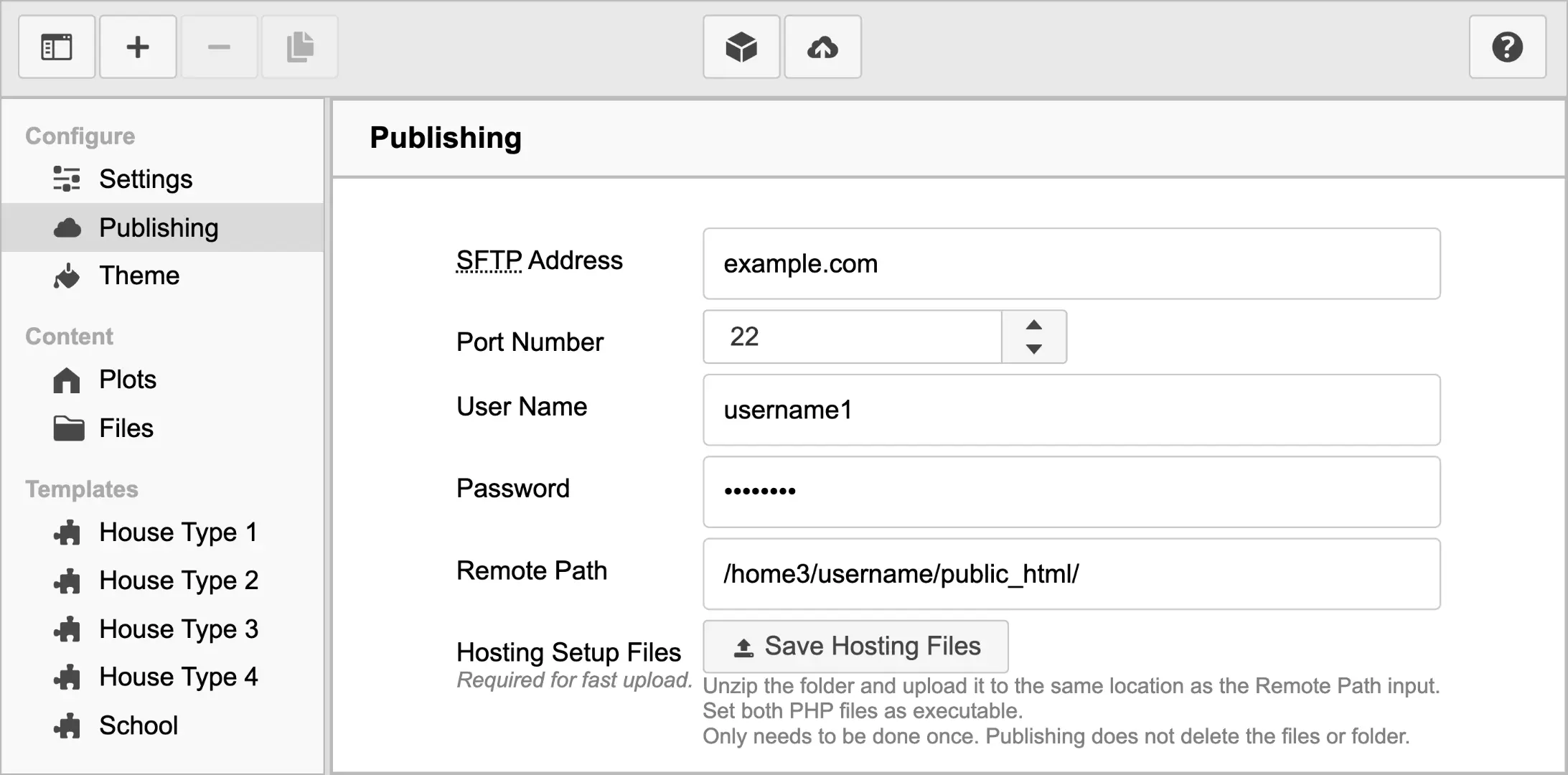
SFTP Address
Commonly the SFTP address will be the domain name of your website. It might have a subdomain of ftp. For example example.com or ftp.example.com.
Port Number
Generally SFTP servers uses a port number of 22.
User Name
The unique user name you created when purchasing your web hosting or provided by your company IT department.
Password
The unique password you created when purchasing your web hosting or provided by your company IT department.
Remote Path
The folder path on the web hosting server, that you will upload to. Most SFTP web hosting uses UNIX style folder paths. Which are in the style /home3/username1/public_html/, instead of the Windows style of C:\Users\username1\public_html\.
Hosting Setup Files
Contains a PHP script used for speeding up uploading to the web hosting.
Click the Save Hosting Files button  and save the ZIP file. Next unzip the
 cgi-bin folder and upload it to the same location as the Remote Path input.
Set the PHP file as executable, this only needs to be done once. Publishing does not delete this folder or its contents.
Theme
Customise the theming of the home user guides, across the web, eBook and PDF outputs.  Using both the default theming as well as importing custom made theming that can not only change the visual look of the user guides, but also add new features and functionality.
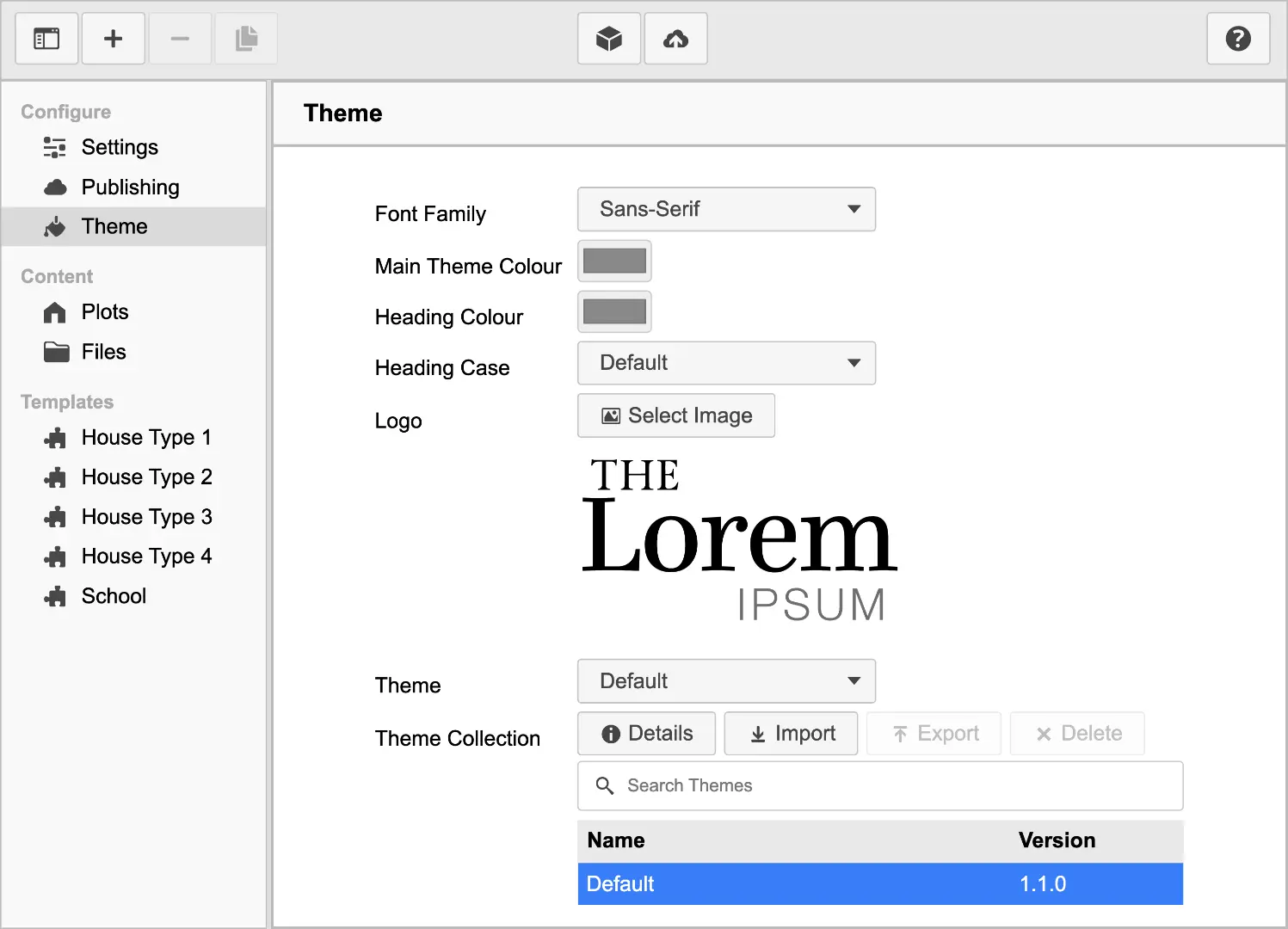
Font Family
Select from Serif or Sans-Serif fonts.

Serif typefaces have extra stroke lines or feet that extend off of end of characters. The Latin for without is Sans. Sans-Serif do not have the extending features.
Main Theme Colour
For the Default theme the main theme colour is used for the colour of the eBook front cover and many other locations and uses.
Heading Colour
Specify the colour of headings.
Heading Case
Select the case used for headings.
Logo
Select an image file for use as the project logo. It is recommended that you use a web optimised SVG format file. If this is not possible, a PNG or JPG file with at least a resolution height of 1080 will work well.
Theme
Choose the theme for the home user guides. The chosen theme not only defines the visual style but also interactive features.
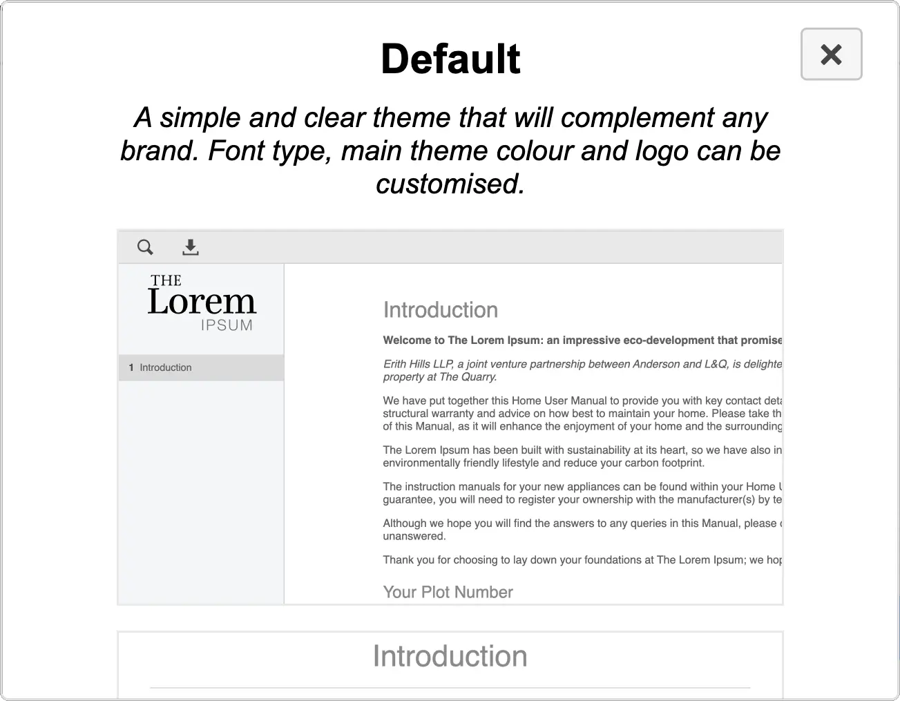
The Default theme is a simple and clear theme that will complement any brand.
Theme Collection
Manage the installed collection of Themes. The themes you install here can be used with any project.
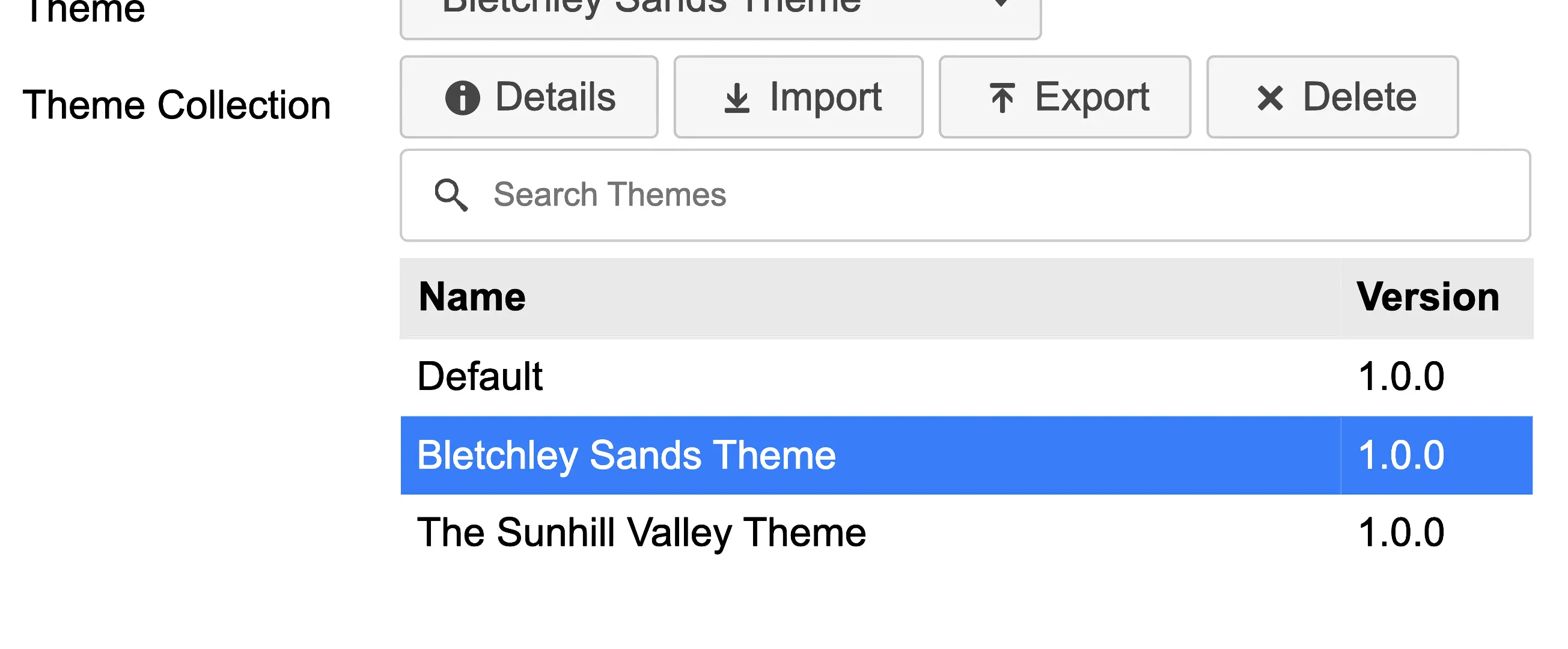
Search
Filter the list of themes by entering text into the search field.  Remember to remove the text from the field to see all of the themes.
Details
Click the Details button  to view a description and screenshots of the theme, to get an idea of how it will look and function.
Import
You can import previously exported themes that you, or others have created. Click the Import button  and your operating systems file picker will be displayed. Find and select a theme file with the extension of
 .hugtheme and click Import.
Export
You can export themes that you have previously imported.
Click the Export button  and your operating systems folder picker will be displayed. Find and select the folder you would like to export the theme to and then click Export. A file with the extension of
 .hugtheme will be created.
The Default theme is the only one that can not be exported.
Delete
Select the theme you want to delete, then click the Delete button  . You will be asked to confirm that you want to delete. This can not be undone.
The Default theme is the only one that can not be deleted.
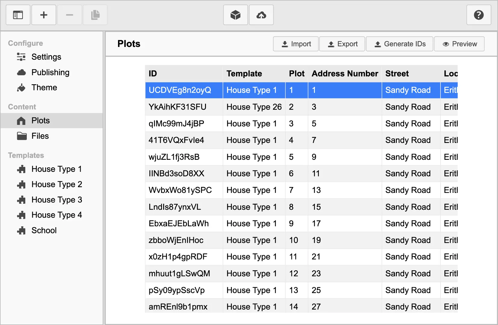
Plots
Import and export the plots spreadsheet.  You can also preview a plot to see what it will look like when published to the web.
Import
Import a spreadsheet in CSV file format. Most spreadsheet software can export in CSV format.
The imported spreadsheet must contain at least the ID and Template column headings. If not, then you will not be able to import the spreadsheet.
Each ID column entry must be unique. This is used in the unique URL for each plot when publishing.
To use a spreadsheet for a specific plot, the Template column must match a name of a template. If no Template matches, that plot will be ignored during published and cannot be previewed.
All other columns can have any other name and can contain any information you require.
Click the Import button  and your operating systems file picker will be displayed. Find and select a plot spreadsheet file with the extension of
 .csv and click Import.
Export
You can export a plot spreadsheet that you have previously imported.
Click the Export button  and your operating systems folder picker will be displayed. Find and select the folder you would like to export the spreadsheet to and then click Export. A file with the extension of
 .csv will be created.
Generate IDs
Clicking the Generate IDs button will allow you to create a a list of random and unique IDs for your plots spreadsheet.
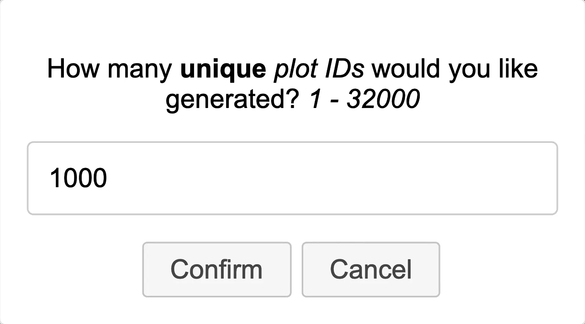
Enter the number of unique and random IDs and then press confirm. Your operating systems folder picker will be displayed. Find and select the folder you would like to save the CSV spreadsheet to and then click Save. A file with the extension of .csv will be created.
Preview
You can generate a preview of one of the plots. This allows you to see what the home user guide will look like when exported, without having to publish every plot.
Select the plot row in the table that you would like to preview, then click the Preview button.  This can take sometime, depending on the size of the template that plot uses. When the preview is created, a window will be displayed.
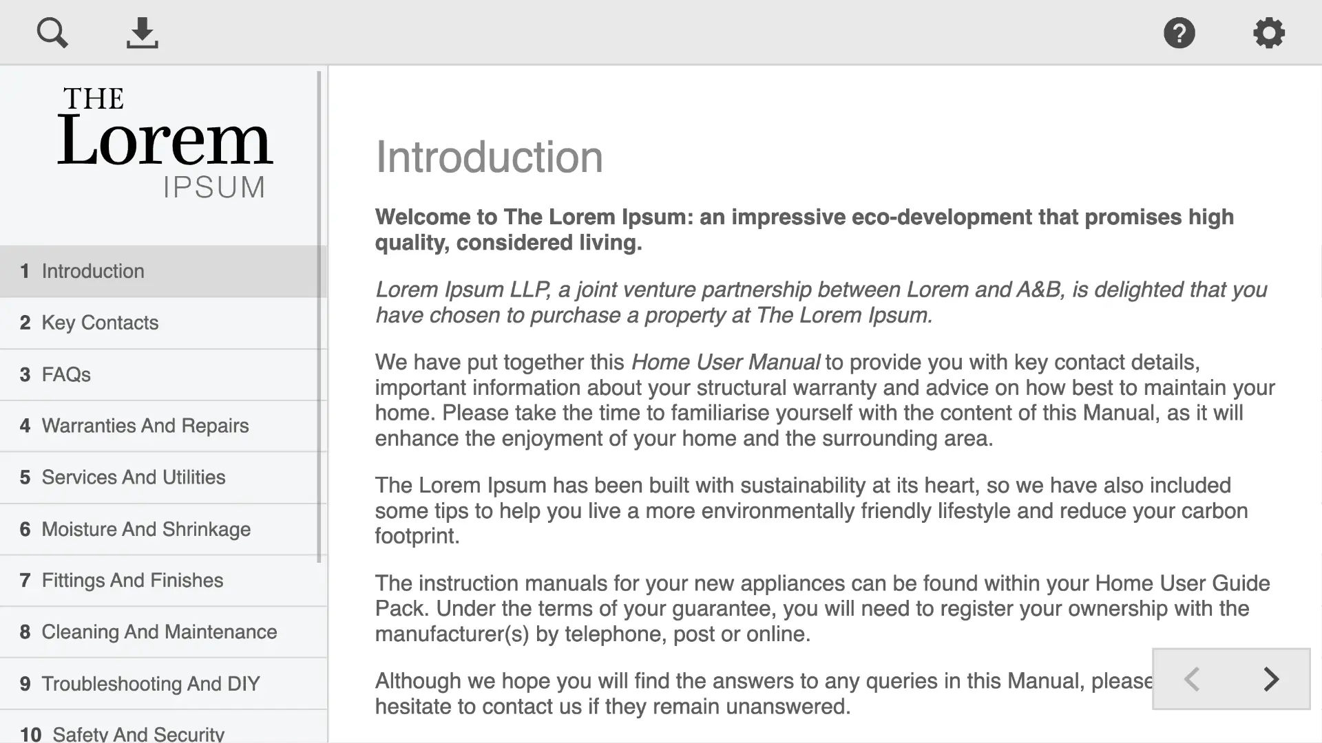
You can then navigate the HUG Webapp as if you were in a web browser. When you have finished previewing the webapp, you can close the window and continue using the HUG Manager app.
Files
Before a file can be used in a project, it must first be imported.
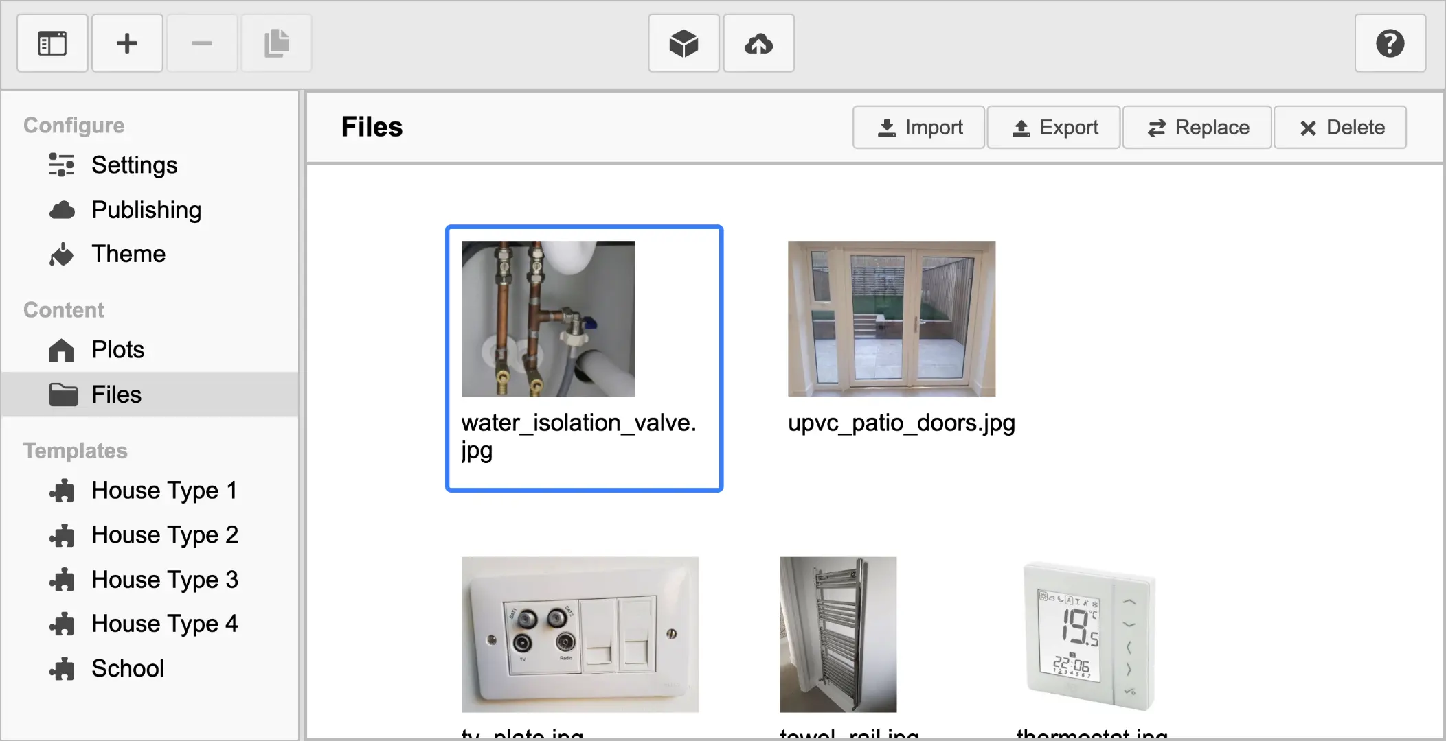
Import
Import any file type by clicking the Import button  . Your operating systems file picker will be displayed. Find and select one or more files and click Import. The import process can take a few moments depending on the number of files.
Image files will be displayed with a small thumbnail version. All other file types will be displayed with an icon. The original file name will be displayed below the file. This is to make it easier for you to identify the file you require.
Export
You can export files that you have previously imported. Click the Export button  and your operating systems folder picker will be displayed. Find and select the folder you would like to export the file to and then click Export. A copy of the file you selected will then be created.
Replace
If you use a file in multiple locations within a project, you can replace it with a different file by clicking the Replace button  .
.
This is useful when needing to change a file, logo or chart. It is also useful when using an previously created project as the basis for a new project and only need to update a few of files.
Delete
Select the file you want to delete, then click the Delete button  . You will be asked to confirm that you want to delete. This can not be undone.
If a file is in use anywhere in the project, the Delete button will be disabled, you will not be able to delete the file. Once the file is no longer in use, you will be able to delete the file.
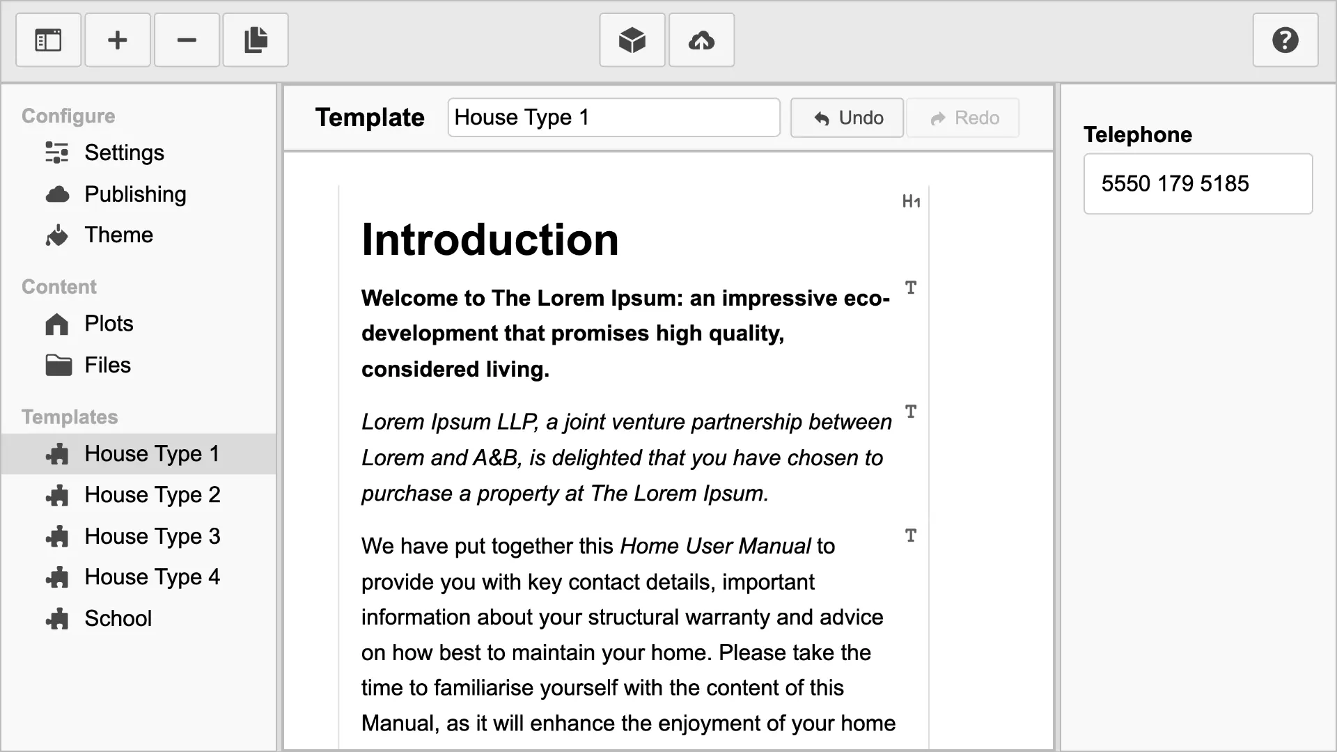
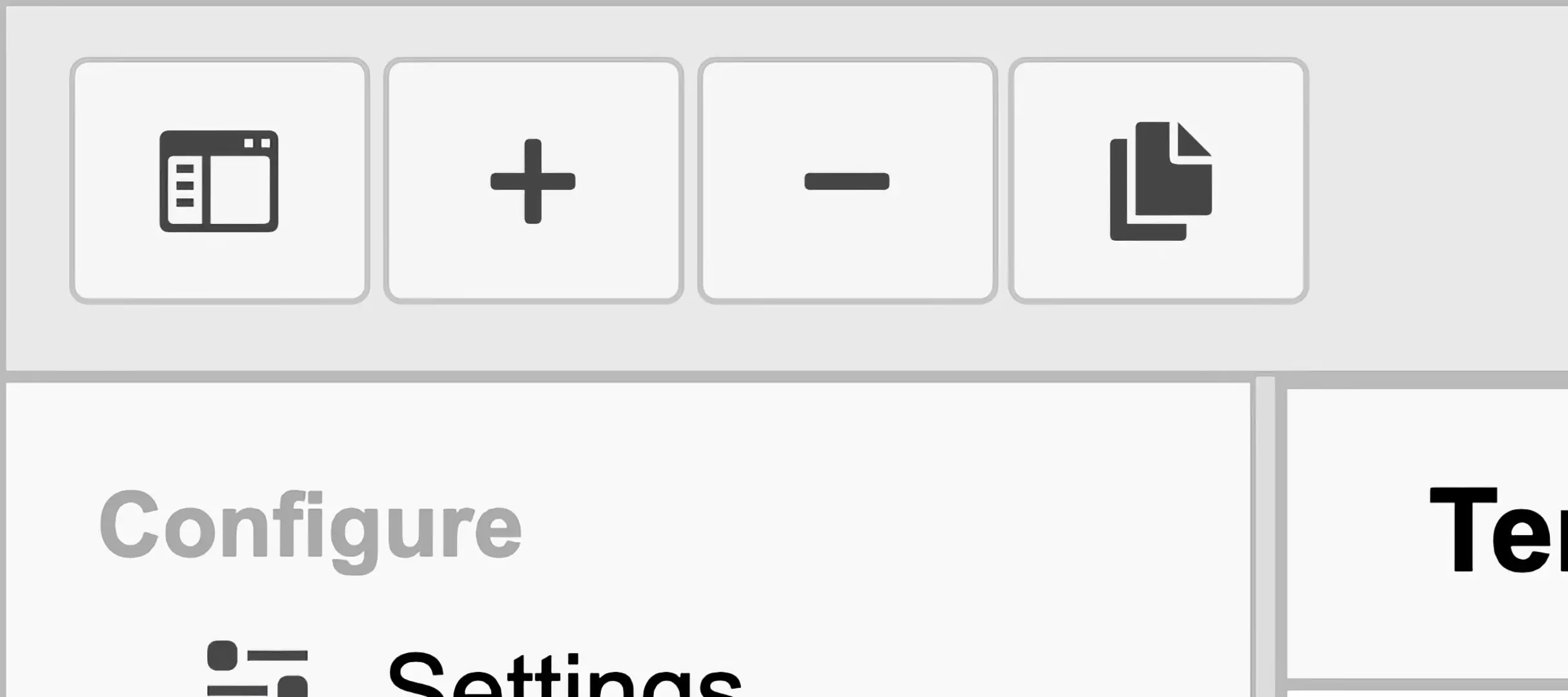
Templates
Templates are where you'll create the user guide content.
They can be added  , deleted
  or duplicated
  , using the app toolbar buttons.
If you can use a word processor, then you'll feel comfortable entering content into the templates. One difference is that you focus on meaning, not what the content looks like. Styling is handled by the app during publishing.
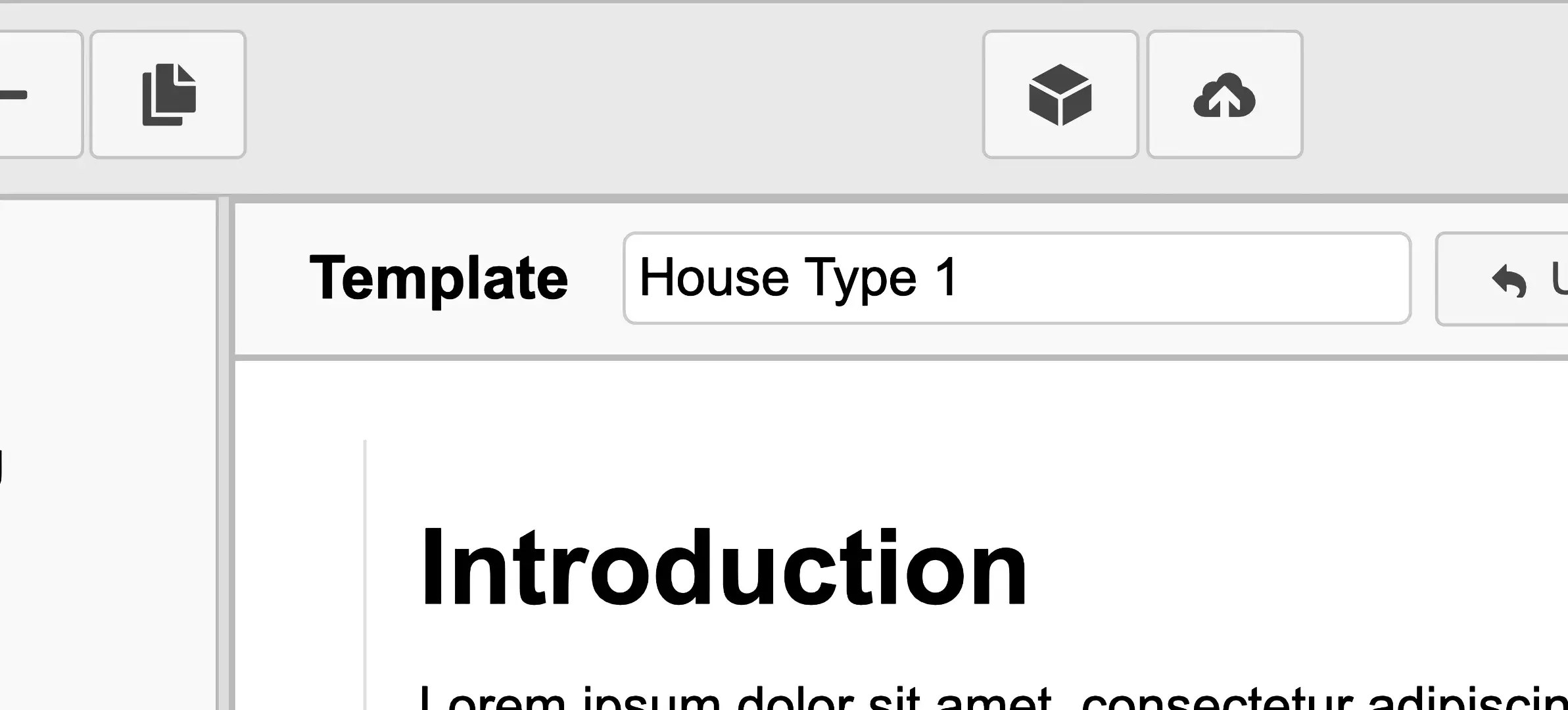
Template Name
Change the name of the template by entering text into the input box above the template content. The template name will be saved if you press Enter or the input box looses focus.
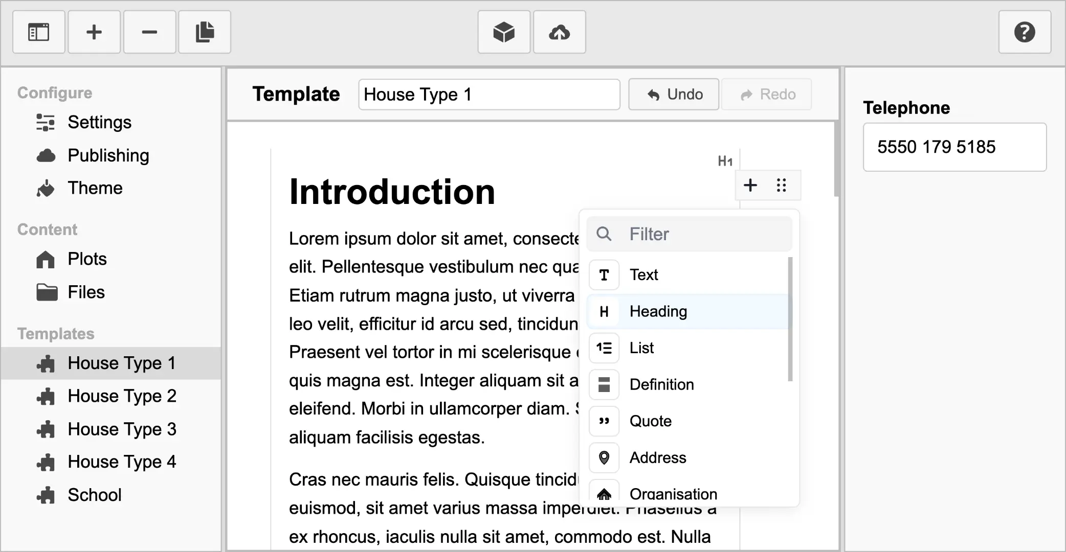
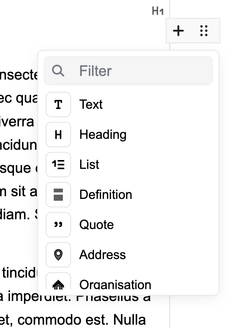
Blocks
The content is made up of different types of blocks.
- Text
- Heading
- List
- Definition
- Quote
- Address
- Organisation
- Table
- Image
- Video
- File
- Delimiter
- Alert
Each block can be used for different media types, styling, semantic structure, or many other needs.
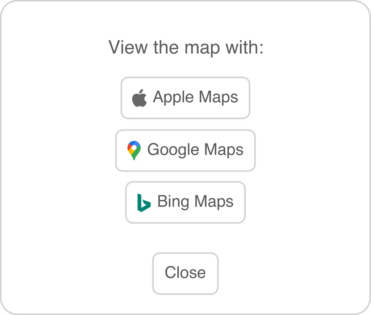
For example, by adding an Address block, the webapp gains the ability to open up addresses in popular mapping solutions by Google, Microsoft and Apple.
Or using the Definition block for FAQs. With the question being bolded and the answer being below and positioned close to the question. The Definition title and description are also semantically associated, which helps screen readers when speaking the content.
Pick the block appropriate for the content you are creating. This allows the app to know the semantic meaning of the content and style it appropriately for all the formats it will publish to.
User Guide Sections
The HUG sections are divided by the use of Heading 1. This makes it very easy to structure the content.
If you want to start a new section, just insert a Heading 1 block.
Adding and Tuning Blocks
When you hover over a block, two buttons appear to the right. 
Add Block
When clicking the Add Block button , a popup will display a list of the available blocks. Clicking a block type will create the new block after the block you are hovered over.
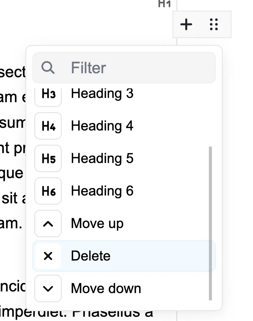
Tune Block
Click the Block Tune button to display a popup for each block to tune it to your needs. This could be by changing the heading type from 1 to 6, or change the size of an image. Each block will have a different set of tune options, but at minimum will be the ability to delete the block or move it up or down.
Text Paragraph 
Enter any text and use any of the inline tools. Each paragraph will be a separate Text block.
Heading 
Use Heading 1 to Heading 6 to structure the template.
 The HUG sections are divided by the use of Heading 1. This makes it very easy to structure the content. If you want to start a new section, just insert a Heading 1 block.
List 
Once the List block is inserted, each Return key press will add a new list item below. This block behaves like most word processor lists, tapping Return in an empty list item will change that list item into a paragraph.
The tunes for this block give the option for Unordered or Ordered  list types. By ticking the No Style checkbox, it will remove the list styling, but still keep it a semantically Unordered or Ordered list.
Definition 
The Definition block can be useful for things like FAQs or a glossary. Where you would like to associate two pieces of text, one a title/term and the other a description.
Quote 
Add a quote to the content with this block. It adds left and right space to the text, along with a caption below. Add the source of the quote in the caption input.
Address 
With the Address block, the webapp gains the ability to open up addresses in popular mapping solutions by Google, Microsoft and Apple.
Organisation 
Organisation can be used for adding a business, government, institution or an association. It includes the organisation name, address, telephone, fax, email and URL.
Just like the Address block, the location can be opened up in a mapping service.
Table 
Insert a table, with each cell acting like a Text block. Add  and delete
  any number of columns and rows.
The Table block tunes give the option to convert the first row into the table headings. 
Image 
Add images into the template. Click the Select Image button and pick an image file that you have imported. Currently supported image file types, .jpg, .jpeg, .png, .gif, .svg. Imported image files can be full size as the app will resize them to the appropriate resolution and file size needed.
Enter a short description of what the image depicts. This will assist those with sight or cognitive challenges.
Add an optional caption if required. This text will appear below the image when publishing the template.
Tune the block with the option to set the size. Tiny, Small, Small Medium, Medium, Large, Full Width.
Video 
Add videos hosted on your web hosting.
Add a poster image that will inform the user what the video is about. Or it can simply be a screenshot from a moment in the video that is indicative of videos contents.
You can also supply a Title and Description for the video.
It's recommended that you include at least an MP4 video file, encoded in H.264 or H.265. As it has excellent supported on most operating systems and devices. WebM is a good fallback format for a device that does not support MP4.
Videos will not be exported into smaller web optimised files. Make sure your imported video files are ready for viewing via the web.
WebVTT Captions can be useful for those with disabilities, but are also used by those that want to consume video content without sound.
WebVTT Chapters is available with some web browsers. Allowing you to skip to a specific section of a video, without having to scrub through the video.
Tune the block with the option to set the size. Tiny, Small, Small Medium, Medium, Large, Full Width.
File 
The Files block allows the user to download any file you have imported.
Delimiter 
Placing a Delimiter block above and below content can show a change in the flow of content. Can also be used for bringing emphasis or importance to content.
Alert 
The Alert block is used for communicating information that will not be published. Make notes for yourself or others editing the templates.
Inline
Inline tools allow text to be changed. Some parts of blocks will allow all available Inline tools to be used, others will restrict to a subset.
Highlight text and a popup will appear near the selection. Tap the required button to add the change to the text.
For inline tools with options available, UI elements will appear in the Inspector Sidebar to the right of the template. The highlighted text will be wrapped in a coloured element with an icon to the left. Tap the icon to edit that tools options in the Inspector.
Bold, Italic, Underline, Strikethrough, Subscript and Superscript


The inline tools, Bold, Italic, Underline, Strikethrough, Subscript and Superscript all behave like those used in word processor apps. These have no options to change, so no UI elements appear in the Templates Inspector.
Abbreviation/Acronym 

Add the full wording for an abbreviation or acronym. A single text input is provided in the Inspector sidebar.
Telephone 

Changes the selected text into a link that will open the specified phone number in the devices telephone app.
Email 

Clicking the text will open the default email app and create a draft email to the specified email address.
Hyperlink 

Create a hyperlink to any valid URL.
Internal Link 

Link to any heading in the template. In the Inspector sidebar will be a drop down menu listing all the headings. The list is divided into sections between Heading 1.
Token 

This powerful Inline tool allows for inserting information from the imported Plots spreadsheet.
Two drop down menus are available in the Inspector sidebar.
First is the Token name. This will be the heading for that column in the Plots spreadsheet.
The second menu will specify the Token Type. The options are Text, Telephone, Fax, Email, Hyperlink. It will default to just inserting the information as plain text. Or it can turn the Token into a Email or a Telephone link.
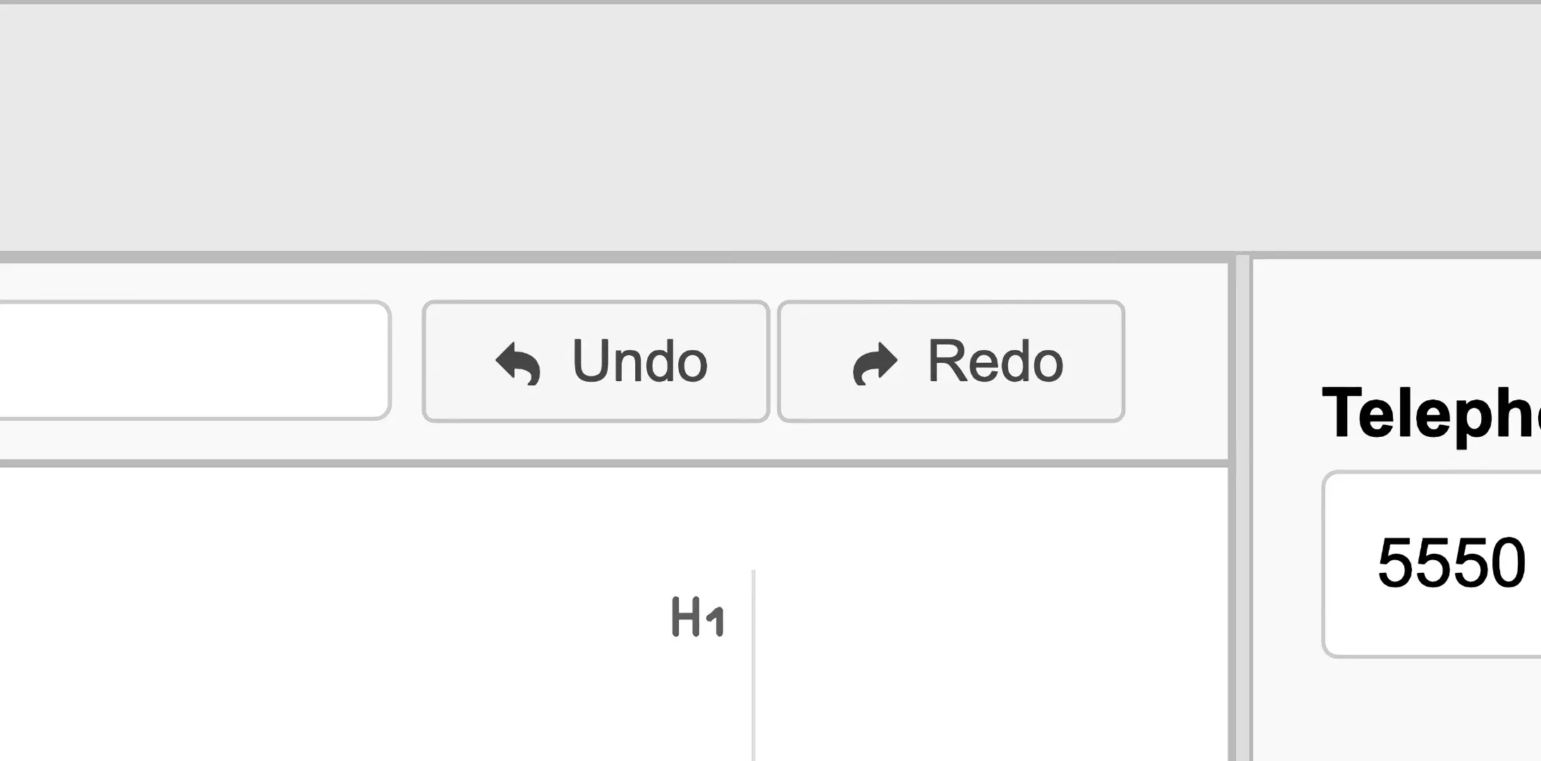
Undo and Redo 

Undo and redo changes you've made to the template. The app currently has a 20 changes history.
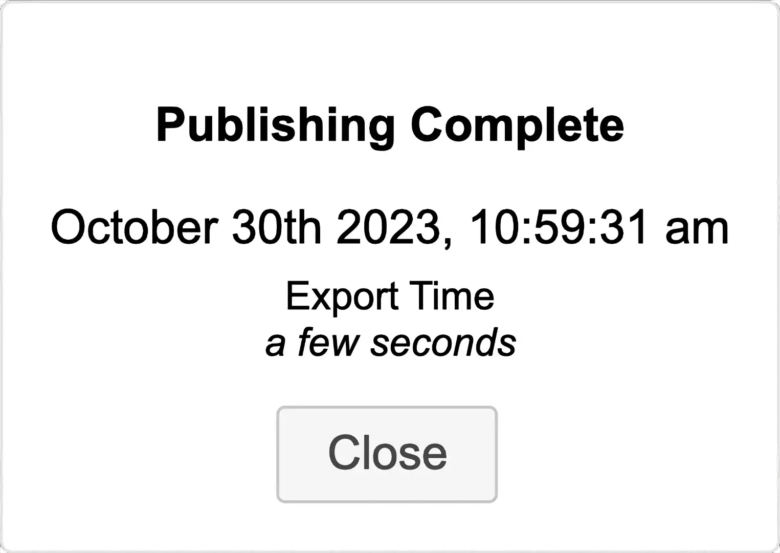
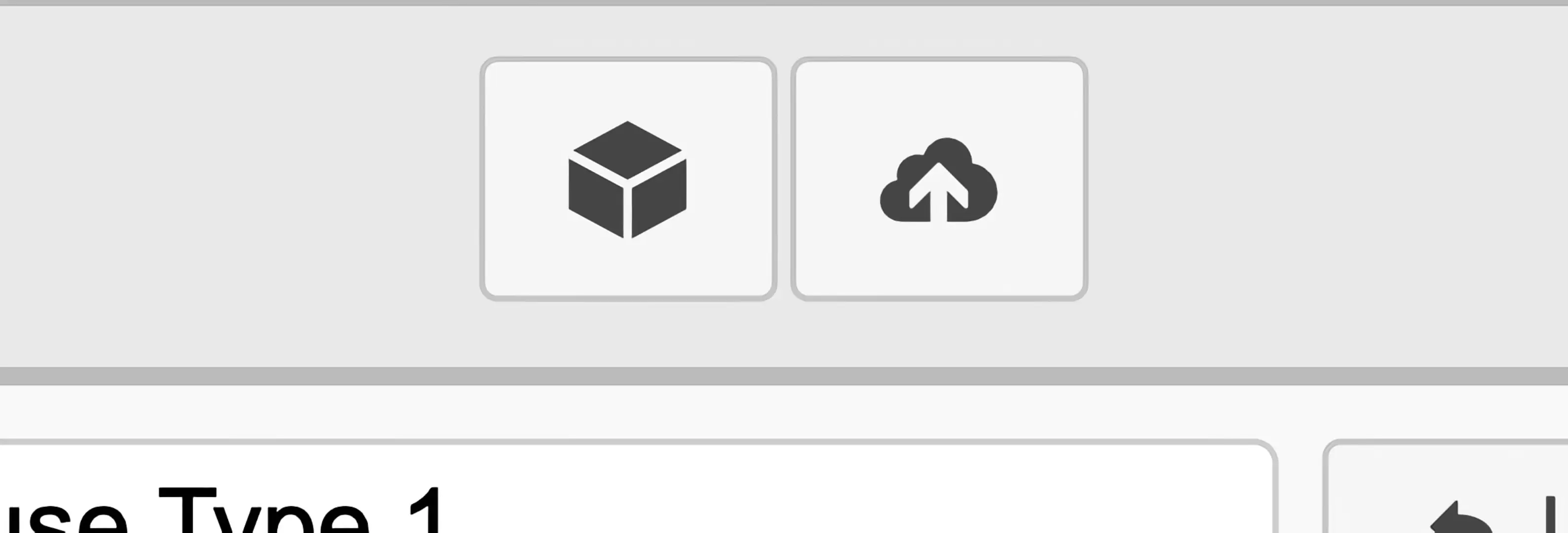
Publish
When the home user guide and configuration has been completed, tap the Publish button  to begin publishing to the specified web hosting.
You will be presented with a popup asking for confirmation to start the publishing process.
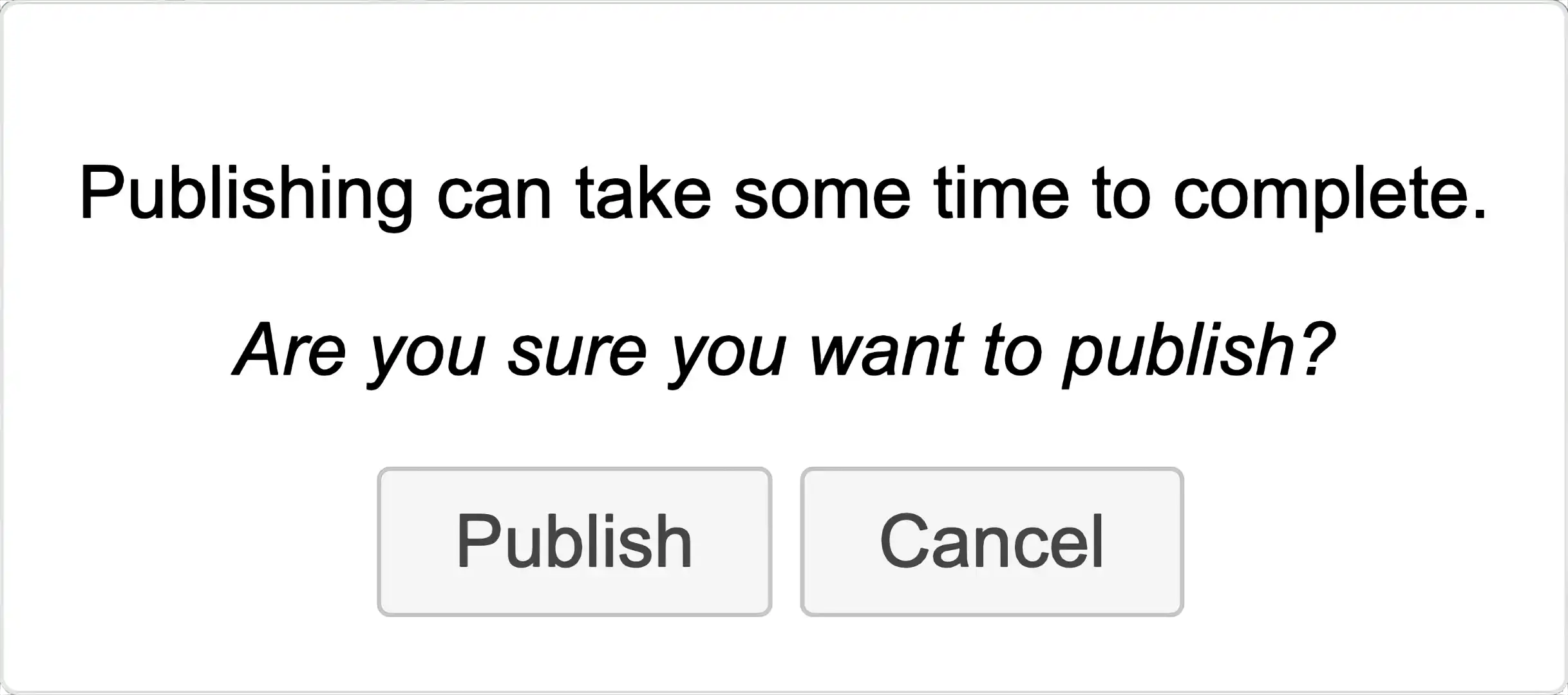
The app will test the connection to the web hosting, as configured in the Publishing app section. If it passes this test, the upload will begin.
This can take an extended period of time, depending on the total sizes of all the files.
Once complete, you will be presented with a popup giving the date and time of when the publishing finished and how long it took.